(I wish there was a simple way to make people pose better for the camera, especially family members.)
 |
| Luka: First Moments and Blessed overlays from Kate Pertiet, digital frame from House of 3, other unknown papers and embellies. |
In preparation for Luka's 1st birthday, I took photos of him and his newest developments all that week. The challenge in the Dimensional Details class was to make an all-boy page.
 |
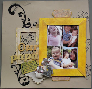
| Our Papa: Donna Downey huge stamp, mushrooms and butterflies from Louise Williams, postcard frame from LivE Designs |
 |
| Our Girl: design by Nic Howard, journal spot by Kate Pertiet, ink from the Tim Holz distress ink collection, unknown papers and embellies. |
I have a funny story about the two lay outs above. I prepared all materials for both and brought them to the June Craft n Chat. While I was there, I only had time to work on the 1st lay out, with the yellow frame. I wasn't paying much attention and inadvertently put the 5x7 of Ailin wearing sunglasses in the yellow frame, and after I had done that, I made a title "Our Girl" and a little journaling card all about how sassy she is.
Something didn't look quite right. The yellow and the pink didn't quite go together. The masculine colors and embellishments didn't look right with her sassy sunglasses pose. At the same time, some of the CnC participants were criticizing my hobby of scrapbooking (see my post called Crafticism). Then, one of the ladies point-blank said, "What are you doing? I just don't get it." I am still not sure if she was referring to scrapbooking itself or if she was talking about the obvious and hideous clashing page I was just putting the final touches on!
After arriving home, I thought about it and finally realized that I had used the wrong photo and it would need to be redone. The masculine-looking page was meant to be an ode to Father's Day! I fixed it rather quickly by adherring the correct photos over top the original 5x7, carefully removing the title and journal spot and putting a new one down. Done! Oh, and the coolest thing happened on the way back from the CnC. A small bottle of water leaked inside my bag and soaked a few of my papers that I had printed on the ink jet printer. This caused the ink to run and form these absolutely gorgeous colors. I cut out a portion and used it for my new journaling spot.
The second one needs no explanation really, but I want to say that I collected some paper doilies from the dessert plates at a restaurant we ate at recently and used one on this lay out.
 |
| Digital template from Colie's Corner. |
No comments:
Post a Comment