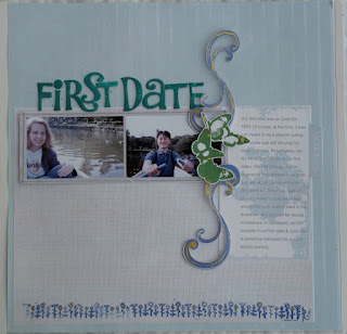
Well, it was March and I was very much dreading going back to work, so some of my lay outs reflect that. Here goes one of them.
This is my first lay out for a mini-album called "Why". This class is a self-paced class that I downloaded from Big Picture Scrapbooking. I mentioned this class recently on the blog.
It's crooked. I know. That happens sometimes, doesn't it? Anyway, this was a Cathy Z design, using some downloaded elements from the hybrid class which I worked with on Photoshop and printed out separately and cut out, and then assembled with real glue tape.
I sometimes try to make lay outs for my Love Story album and this is another one. For the Cathy Z class, we were asked to take one of her designs from earlier in the class and alter it.
This is one of my favorites! I am so in love with this one. The colors are so bright and cheerful. It was fairly easy to make. The papers were a free download from Two Peas in a Bucket, printed on to cardstock, and then cut out. I used flower rub-ons to sort of blend in with the flowers on the green paper. This was a Cathy Z template, and I think the focus was on making titles that stand out.
My husband thought this was a boring lay out, especially compared to all the others I've made recently. For the hybrid class, we were asked to use a digital template. I sized it down, printed it out on photo paper, found a journal box and added a little swirly thing to it. Put everything together with matching cardstock and some inking. Simple & flat is good because albums can get really thick if you have 3D elements on every single page!


3 comments:
I love your layouts - I hope you had as much fun in hybrid class as I did. You're so very creative!
Is that your handwriting in WHY? I like that.
In Amigos, is that a font or your handwriting? Again, very nice.
Taking time to write creatively should never be underestimated... Everything lovely.
Thanks, May, for checking my blog and making a comment! Means so much!
Kirsten,
That is a computer font that I downloaded for free from dafont.com. I suppose I should indicate more detail about my lay outs but I don't want to bore average readers (aka, my friends and family who probably just want to see the photos).
Post a Comment